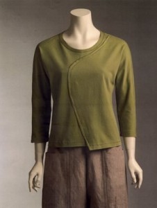
A comment by bananaoil on my patternreview.com review of this pattern got me thinking, so I went back to this shirt, whose failings I’ve discussed in detail in a previous post. This top turned out to be very boxy, and the neck band was, well, dreadful. So I changed a few things. Here’s the Marcy Tilton/Vogue photo:
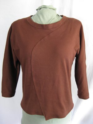
First of all, I folded the neck band in half, toward the inside of the shirt, encasing the top edge of the neck opening, and hand-stitched it in place. That gave a much cleaner look, and also brought the size of the finished edge much closer to the look on the Vogue envelope.
Then I tackled the boxy look. I couldn’t very well lengthen the top, but I could tackle the sides. Beginning below the bust (which fit just right), I tapered from nothing to a whopping one and one-half inches at the hem. That’s a grand total of six inches taken off the width at the bottom! But it improved the looks quite a bit, as you can see:
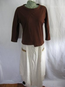
I still think that this top could use another inch and a half to two inches in length, but I was surprised to discover that my altered top looks much more proportionate when it’s paired with Marcy’s wonderful skirt (Vogue 8499):
The neckline still isn’t right, though, and (not surprisingly). I haven’t decided whether it’s going to be worthwhile to alter the length, and work out a neat finish for the raw edges in a new top. I think I’ll move on in the meantime, and give the whole thing more thought before committing any more time to making another one. I do love that curved line; I wish Vogue had done a more careful job of scaling this pattern.
Update 4/20/08 – Marcy Tilton wrote a generous and helpful response to my review of this pattern on Pattern Review: you can read it in the comments by clicking here.


